Posts

Showing posts with the label WhiteHat-Seo.co.uk Responsive Web Design

How Businesses Risk Losing Customers by Ignoring Google’s Recommended Mobile Friendly Configuration

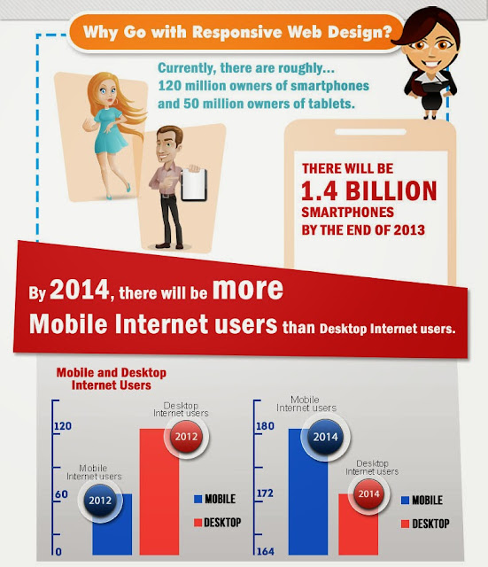
Mobile Internet users are expected to outnumber desktop users by next year. It is therefore no surprise that Google is paying close attention to this development. And so should you. Because if your website is not yet “mobile responsive,” you may be turning away prospects who browse your web pages via smartphones, tablets, or laptops. And frankly, mobile users are prospects you wouldn’t want to lose. Non-Mobile Ready = Non-Customer Friendly A study by Sterling Research and SmithGeiger for Google found that a whopping 96% of users have encountered a website that is obviously not designed for mobile. This would not have mattered to you if not for the following findings also uncovered by the same study:

Responsive Web Design: Prevent Potential Sales Loss with a Mobile Friendly Website

Image
Many business owners today tend to ignore the importance of having a mobile friendly or “responsive” website. Without realizing it, they may be losing prospective leads and sales because their website is not designed to load properly on mobile devices such as laptops, tablets, and smartphones. Here’s why you should not be one of them, and how you can make your website responsive:

Mobile Responsive Web Design - Getting More Leads and Sales

Image
Go for Mobile Responsive Web Design [Infographic] Getting More Leads and Sales, Not Just Fancy Cosmetic Redesign Implementing responsive web design means opening up your online storefront to mobile visitors, effectively increasing your chances of getting more leads and sales through your site. While it may come as a mere fancy redesign to some business owners, you should realize that this change is geared toward marketing more than cosmetics. Making the decision to have a responsive site means giving your business more opportunities to grow, especially for the long haul.